Contents
Definition Logo
A logo – also called a word mark, figurative mark or word/figurative mark – is a symbol used to identify an organization, company, brand or product. It is usually a unique combination of symbols, fonts and colors used to visually represent the organization’s identity. Logos are often used on products, marketing materials, websites and other media to promote brand recognition.
What should a logo achieve?
Because the main purpose of a logo is to attract the attention of the TARGET GROUP and to be concise and as recognizable as possible, it does not have to be fully decipherable. Think of iconic, world-famous logos such as those of Deutsche Bank, Nike or Mercedes-Benz: all of these logos have a certain degree of abstraction. None of them represent what the respective company offers or produces. They stand (or stood) for a promise: for healthy growth, athleticism for all, the best without alternative.
Why is a logo important?
Alongside the BRAND NAME, the logo is obviously the most prominent CORPORATE DESIGN ELEMENT. As a central component of the appearance of a BRAND, it serves to identify a company. It must therefore differ significantly from other logos in the same market niche in terms of design language, COLOR, typography and ICONOGRAPHY. Its function is not so much to provide information about what a company actually does, but rather to convey a sense of CORPORATE IDENTITY – because this is ultimately what differentiates market participants from one another. Our BRANDING or DESIGN PROCESS therefore aims to make the logo unique on the one hand and to evoke positive associations with the brand in relation to its offering on the other. This can be, for example, trust, tradition, dynamism, lifestyle or status awareness.

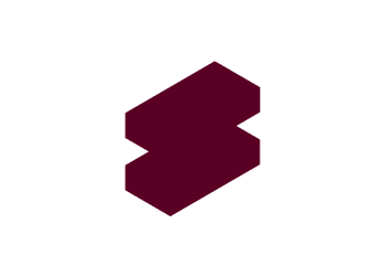
The Siemens logo – from monogram to word mark © Logo Insider
History of the Logo
The roots of logos go back to ancient Greece. The word “logo” comes from the Greek word “logos”, which means word, speech, teaching or meaning. Potters left markings on their works to identify their origin. Over the centuries, the concept developed further, e.g. in the form of monograms used by rulers or dynasties as seals for letters or on coins. However, it was not until the age of industrialization that the logo began to take on the forms we know today. Industrialization brought with it mass production, as a result of which companies began to mark their products and services with memorable symbols and lettering. With digitalization, the logo has become even more important, as it has become a key tool for branding.
Logo types
Logos are an essential part of any brand identity. They naturally come in different shapes and styles, each with their own unique characteristics and applications. A basic distinction is made between the following types of logo:

Figurative mark
The figurative mark, also known as a symbol logo, consists of a graphic symbol or abstract representation, as the SIDES case shows. This type of logo is particularly effective at promoting visual brand recognition without relying on text. A globally recognized example is the Nike Swoosh, which represents the brand even without words.
Word mark/character mark
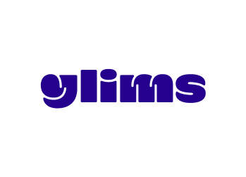
The word mark, also known as a character mark, consists of the name of the brand in a specific font that is often developed or customized exclusively for the brand, such as for GLIMS. An example with a long history is the Coca-Cola logo, which represents the brand name in a unique font.
Word/figurative mark
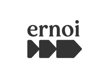
The word/figurative mark combines both text and a graphic symbol to represent the brand, such as ERNOI here. The advantage of this type of logo is that it conveys more information, as visual elements are combined with text. A good example is the Lufthansa logo, which shows the brand name next to a crane.
Emblem
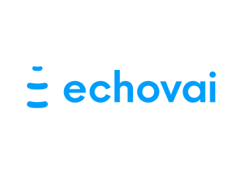
The emblem logo, like this one from ECHOVAI, integrates text within a symbol or graphic. This type of logo often conveys an established, high-quality feeling and is therefore frequently used by governments, institutions or even luxury brands. An example of this is the logo of the car brand Lamborghini with the legendary bull Murciélago, which survived a bullfight with 24 lance thrusts on October 5, 1879.

Letter marks/monograms
Lettermarks consist of the initials or abbreviations of a brand in a stylized form. This type of logo is particularly useful for brands with long or complicated names and allows for a compact representation of the brand. A well-known example is the IBM logo, which displays the company’s initials in a distinctive font.
Siegel und Wappen
Seal and crest logos either derive directly from a historical context or use such symbolic language to lend tradition and authority to a brand. This type of logo is therefore often used by institutions, universities or organizations of historical significance. An example is the Harvard University logo, the Veritas shield, which is composed of heraldic elements.
What makes a good logo?

Good logo design captures the essence of the brand
Simple, but not simplistic: good logos are the refined and distilled IDENTITY of a brand. Filtering this and getting to the heart of it visually is an essential part of the design task. Such logos are characterized by something unexpected or unique, without coming across as too contrived or deliberate. Supposedly simple logos are usually easy to (re)recognize and memorable. This makes them very effective because they have the power to catch the eye of viewers in the daily noise of information, even in fleeting encounters with a brand.
Good logo design is based on content
The logo takes into account the POSITIONING of the brand and its target group: a childish font and very colorful color scheme would be appropriate for a logo for a toy manufacturer, for example, but less so for a consulting company. On the other hand, the logo does not have to be too direct and therefore uninspired. A successful logo for an interior design brand does not need to show a couch to work, see point 1.
Good logo design is distinctive
The main task when designing logos is to create an unmistakable, memorable and clear symbol for a brand. It is therefore essential to get an OVERVIEW of the logos of market participants – which means occasionally having to say goodbye to good ideas that someone else unfortunately came up with EARLIER.
Good logo design is contemporary and timeless at the same time
A good logo should have a certain half-life. That’s why we make sure that we use design elements such as typography, color and design language that are appropriate not only to the brand, its services and the industry, but also to the context of the time.
Good logo design is designed for versatility
An effective logo is scalable in size and works in a variety of media and applications. Optimally, it loses none of its power when displayed in monochrome, black and white or inverted, i.e. light on a dark background or vice versa. It must work equally well in very small sizes, such as on a smartphone display, or larger than life on a façade banner.
Examples of successful logos
Logos are part of the face of a brand and play a crucial role in creating brand identity and brand recall. To be successful, a logo must not only be aesthetically pleasing and embody the idea of a brand, but also be used consistently and meaningfully at brand contact points, as the following examples show.

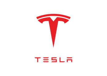
Tesla
Tesla’s word/figurative mark consists of a stylized “T” resembling an electrical circuit and futuristic lettering. This logo embodies Tesla’s innovative strength and technological progress, making it an effective symbol for the brand.
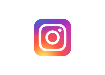
Instagram
Instagram’s globally recognized wordmark consists of a stylized camera symbol that reflects the app’s origins as a photo-sharing platform. The logo conveys a sense of creativity, diversity and capturing moments.
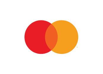
Mastercard
Mastercard is an example of a successful brand logo with a high degree of abstraction. It consists of a red and a yellow circle whose central overlap symbolizes the cooperation and partnership between customer and company. The logo is simple, but very memorable and easily recognizable.
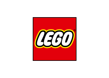
Lego
The Lego logo has been a symbol of play, creativity and fun for decades. It consists of the brand name in a striking, childlike font, intense colors and the design language of the famous bricks, which make the logo unmistakable.

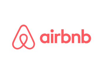
Airbnb
Airbnb’s logo consists of a stylized “A” that is also reminiscent of a house or accommodation. Overall, these examples show that successful logos not only need to be aesthetically pleasing, but should also embody a core idea of the brand.
Logo applications
A logo should be designed in such a way that it can be used as universally as possible.The specific use cases for the brand (e.g. product label) should be taken into account when developing the logo. The following excerpt illustrates some logo applications that have an influence on the design:
Black and white logo
Even if a logo often carries the brand colors, there are many cases in everyday working life where a black and white logo makes sense, such as on invoices. The logo must therefore also function in a learned color scheme.

Embossing
With print media or packaging, you can use haptics to attract attention and signal a claim, for example with embossing or die-cutting.

3D Logo
In digital communication, 3D logos offer a more vivid representation.

Logo Animation
For moving images, it can be important for the logo to be animated. The animation style should be derived from the brand identity or the design system.

Stamp logo
A stamp logo can lend weight and authenticity to a document, and an aura of craftsmanship and uniqueness to packaging.


A logo alone does not make a brand
To be effective, a logo always needs the context of the company, products and services, BRAND DESIGN and communication. A LOGO IS NOT A BRAND. It is the context that charges the logo with meaning, not the other way around. Therefore, it is always – really always! – to have a logo or a word mark or word/figurative mark designed as a single element without considering the appearance of the brand as a whole – it is illusory to expect a singular symbol to stand for an entire entity in a self-explanatory way. It can’t, and that’s not its job – quite apart from the fact that you don’t get very far with a symbol in BRAND COMMUNICATION.
How a logo becomes effective
A logo is and will therefore always remain part of a CORPORATE DESIGN system – albeit a central one. Logo and brand elements must relate to each other in terms of shape, color, typography, style and iconography in order to convey a coherent image of the brand. As a “flag, signature, coat of arms, road sign” (PAUL RAND), the logo must meet a number of requirements: it must not only be concise, easy to grasp and long-lasting, but also work in all media in very small to very large sizes and in color and black and white. These requirements and the specific areas of application have a significant influence on the creative means.
Conclusion: Versatile and recognizable
Design with symbolic power – we’ll show you.

Maurits den Held
Co-Founder, Creative Director
Als Creative Director arbeitete Maurits den Held sowohl in der Berliner Start Up-Szene als auch in namhaften Agenturen für Auftraggebende wie Amnesty International, Gore-Tex und Huawei, bevor er mit Dr. Birgit Joest die BRANDING AGENTUR HELDER gründete. Maurits den Held ist Jury-Mitglied des DDC.