 Book Call
Corporate Design Definition
Corporate design refers to the appearance of a company. It refers to all visual elements of a company such as logo, typography, icons, the color scheme, visual language and others, e.g. key visuals. It should not be confused with corporate identity, which includes corporate behavior, corporate communication and corporate culture in addition to corporate design.
The goal of a defined corporate design is a visually consistent appearance that conveys the special features of the company and thus differentiates it from the competition. The consistent application of the company’s characteristic elements strengthens recognition, which in turn contributes to brand awareness.

A defined corporate design forms the basis for the design of all communication media of an organization:
- the design of the website
- digital communication tools: social media posts, newsletters, advertisements
- print products: out-of-home campaigns, flyers
- business stationery: business cards, letterhead, presentations
- the design of product and packaging
To ensure a consistent corporate image across all touchpoints, the design rules are laid down in a corporate design manual or brand guidelines. Consistent application of the design guidelines contributes to a uniform, professional and unmistakable image to the outside world – and thus to a more positive perception by the target group.
Corporate Design Elements
Corporate design (as well as BRAND DESIGN) is much more than “just” a LOGO. In order to create an overall image with the target groups, a word-picture mark must be embedded in an appropriate design context. In addition to the logo or the word-picture mark, the following elements are especially formative for the design system:
Logo
The image or symbol that people use to optimally identify a brand at first glance, even if the name cannot be seen. MORE ABOUT LOGO DESIGN

Typography
Fonts used by companies or partially even exclusively designed for them, tell a lot about the character of the brand –Colours are carriers of meaning, both culturally and emotionally. conservative, factual, lovely, disruptive, etc

Color scheme
Colors are carriers of meaning, both culturally and emotionally. From colours, observers infer certain (brand) characteristics. Therefore the composition of a colour climate is a central part of corporate design. MORE ABOUT THE COLOUR SCHEME

Imagery style
Images have the power to communicate emotions and messages directly. Essential for this is not only the motif itself, but the mood of the picture: light, colour climate, contrast and composition. MORE ABOUT THE IMAGERY STYLE

Icons
A concise icon system facilitates the communication of content and can contribute significantly to the identity of a brand. Ideally, the brand can be recognized by the style of the icons. MORE ABOUT ICONS

Design grid
The design grid or grid serves to arrange, systematize and stage content. Design laws and principles support the eye movement and thus help to capture content.

Corporate Design Manual
The CORPORATE DESIGN MANUAL comprises the essential components of the brand identity as well as communicative and design rules.
Benefits of Corporate Design
The central task of a corporate design is to give the company or brand an individual personality. As with the first encounter with a person, certain characteristics allow conclusions to be drawn about the value attitude – both positive and negative. The corporate design provides orientation for potential customers who come into contact with the company: they can quickly decide whether the company suits them – or not.
Corporate design is therefore an effective tool for presenting certain characteristics of a company or brand in the most advantageous way possible and thus setting it apart from other companies in the same market. A good corporate design evokes the right associations and expectations through logo, colors, images and other elements, which are ideally fulfilled by corporate culture, corporate behavior and corporate communication. By creating identification potential for the relevant target group, corporate design contributes significantly to customer and employee loyalty.
A consistent and strategically sound corporate design…
…establishes a company as a unified entity
A consistent design helps a company to perceive a range of different products or services and possible sub-brands as belonging together. Even if corporate communications highlight different aspects of the company and address different topics, a consistent appearance always pays off in establishing the company as a brand.
… increases recognizability
If recurring visual elements are used consistently across different media, the appearance becomes fixed in people’s minds and thus increases the recognition value of a brand. Increased repetition is needed to ensure that the brand is remembered by viewers in the long term.
… builds customer loyalty
The target group-specific, strategic development of visual elements creates identification potential for customers and thus supports long-term customer loyalty.
… positions services attractively
If the brand appearance lags behind a high-quality and differentiated offer in terms of quality, it supports neither BRANDING nor sales. Therefore, a good corporate design is important to adequately communicate and market the added value of a product or service.
… differentiates the brand from the competition.
A well thought-out corporate design helps to visualize and thus highlight characteristics that distinguish the company from others. A consistent visual brand profile creates trust among stakeholders and thus means a market advantage.
… helps with employee retention
Potential customers who use products and services are not the only people who should feel addressed by a company. Potential employees and partners also identify with an attractive corporate design – ideally, they are proud of it.
For whom is corporate design relevant?
Companies starting up
A new company in the market, which is not yet able to prove itself through the experience of its customers, is evaluated primarily through its visual appearance. Due to the lack of company history, a professional corporate design is all the more important in order to establish oneself as a company to be taken seriously.
Companies that are growing
As soon as the start-up phase has been completed, during which testing is still in progress in some cases, it is time to put things in order. The first appearances of start-ups often have a provisional character, as resources are not yet sufficient to create the corporate design holistically, and both strategy and offering are still evolving. Design elements often emerge organically. At some point, one notices that a different logo appears on the flyer than on the website, or that sometimes round and sometimes rectangular buttons are used. A consistent revision of the design helps to strengthen the professionalism of the company.
Companies that change
When companies grow and evolve, the brand often doesn’t grow with them. Sometimes there are major changes that result in the need to adjust the corporate strategy and therefore the corporate design. Reasons for a REBRANDING process, include:
- new products and services
- internationalization
- personnel changes
- structural changes
- social developments
Corporate design process
A successful corporate design system has the power to create a sense of brand at first glance. Values and services such as craftsmanship, digital expertise, sustainability or exclusivity can be conveyed in this way. This gives consumers, but also professionals, orientation as to whether the company with its culture, products, services fits one.
The corporate design process consists of five phases: 1. briefing, 2. analysis, 3. strategy, 4. creation and 5. implementation.
1. Briefing
A corporate design brief is a written document that summarizes an overview of the goals, requirements and framework of a design project. It is intended for external partners such as agencies. In addition to the strategic goals and reasons for rebranding, an effective design brief includes a project overview with key data, such as budget and timing, defines the target audience the company is addressing, lists the companies that are among the competition, and documents the brand personality or mission statement.
If the strategic brand personality is incomplete, outdated or entirely undefined, a BRAND WORKSHOP helps to clearly work out what the brand really stands for, to which target group it is relevant and how to reach them.
A good briefing enables a structured approach to the project, simplifies communication between project participants and thus facilitates the design process.


Corporate design process
A successful corporate design system has the power to create a sense of brand at first glance. Values and services such as craftsmanship, digital expertise, sustainability or exclusivity can be conveyed in this way. This gives consumers, but also professionals, orientation as to whether the company with its culture, products, services fits one.
The corporate design process consists of five phases: 1. briefing, 2. analysis, 3. strategy, 4. creation and 5. implementation.
3. Strategy
The basis for corporate design development is the substantive and strategic development of an individual brand strategy. In this step, one defines the personality of the brand, its BRAND VALUES and goals. Always in view are the wishes and expectations of the target groups one wants to address and the competitors on the market.
As brand consultants, we use a brand workshop to define unique selling propositions, target group needs, values, brand core, BRAND PURPOSE, VISION STATEMENT and MISSION STATEMENT. The results lead to a brand model such as the Helder Brand Frame®. The Brand Frame forms the content basis on which to create the corporate design.

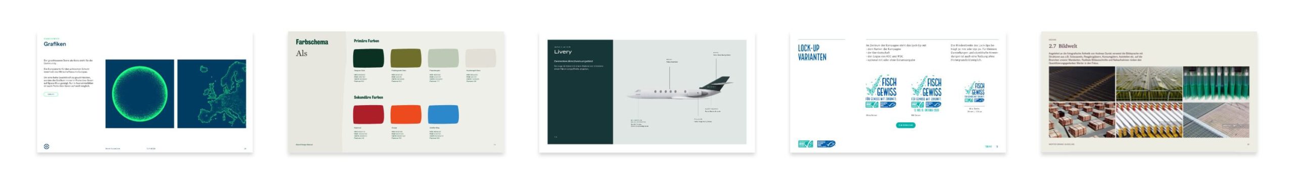
4. Creation
The creation phase includes the actual development of the corporate design elements:
- LOGO
- Typography
- COLOR SCHEME
- Icons
- Key visual
- IMAGERY
- Layout system
Which design elements express the character of the brand? Which colors and shapes visualize e.g. joy, security or digitality? Which typeface makes approachable and which exclusive?
A competitive analysis makes it clear which visual codes are common in the industry and where an approach to differentiation lies. In the development of a corporate design, several routes are first opened up and tested to see which concepts best suit the brand. When a design route is developed, the end product is an agile design system that can be applied to all touchpoints.
5 Implementation and brand guidelines
Once the corporate design has been successfully implemented in practice, the rules for the use of all corporate design elements are recorded in the corporate design manual, also known as BRAND GUIDELINES or style guide. Clearly defined and binding guidelines enable efficient processes and prevent visual arbitrariness that runs counter to consistent brand management.
The style guide therefore explains and documents the design rules for the respective means of communication. These guidelines should be adhered to in all brand communication so that the sender – the brand – is always clearly recognizable. The style guide is therefore aimed at both employees and external trades, such as a design agency. It should therefore be prepared in such a way that:
- rules are easy to follow
- it covers all areas of application
- the design system can be further developed and supplemented
A well-prepared corporate design manual has the following advantages:
- A manual makes it comprehensible whether the corporate design can be used and reproduced cross-medially.
- Clear guidelines prevent uncontrolled growth of visual elements that dilutes the corporate image.
- Internal and external communication processes become transparent and efficient
- The corporate design can be systematically developed, supplemented and differentiated with the help of this tool.
Corporate Design Examples
We are specialized in corporate design.
3 Well-known examples of successful branding
-

Ben & Jerry’s
Everyone knows the humorous and appealing packaging of the ice cream brand. While unusual flavors and fair ingredients help Ben & Jerry’s to achieve a good position in the market, the corporate design helps to transform consumers into fans who are happy to spend more money on a Good Guys ice cream.
-
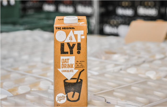
Oatly
A strong attitude and transparent communication make up Oatly’s branding. Swedish heritage and sustainability were ingrained in the brand DNA. With its rebellious brand identity and provocative messaging, Oatly draws attention to the health and environmental consequences of oat milk over cow’s milk. With its 2016 sale to a Chinese conglomerate, the brand came under corresponding criticism.
-

Lululemon
The Canadian it-label for yoga and sportswear combines functionality, comfort and aesthetics with the unique spirit of yoga. Lululemon formulates it in their Purpose: Living a life in practice leads to a more purposeful life – on and off the mat. Lululemon expresses the attitude of many yogis in their corporate design.
What is the difference to corporate identity?
The terms corporate design and corporate identity are often used synonymously. However, CORPORATE IDENTITY refers to the entire corporate identity, i.e. all the characteristics of a company that make it unique and distinguish it from other companies. This includes corporate design, but also corporate culture, corporate communication and corporate behavior.
While corporate identity captures the totality of all aspects of a company, corporate design is the visual expression of all these aspects, which – at least from the outside – are not immediately perceptible. The relationship between corporate identity and corporate design can be compared to an iceberg: The majority of the iceberg lies hidden beneath the surface of the water. Only the tip sticks out for all to see.

Templates for creating a corporate design
Methods, templates and resources to support in the process of branding
-
Summarize your brand identity at a glance: With our Brand Frame® template
-
The SWOT analysis is a proven strategic method that helps companies to identify their strengths, weaknesses, opportunities and threats.
-
A mission statement formulates the added value of a brand’s services and is an essential part of the brand identity.
-
Define for whom and for which needs the brand offers solutions
-
Define a specific goal that the brand wants to achieve within a defined period of time.
-
Align the social added value, the needs of the target group and your own goals.
-
In order to develop a successful brand strategy, it is important for companies to analyze their target groups in detail. The creation of buyer personas helps to create a better understanding of the target group.
-
Clarify the Why, How, and What of your brand to form the strategic foundation.
-
Define the brand identity on 3 different levels with the identity prism template.
-
The brand steering wheel according to Esch is suitable for a systemic analysis of the brand.
-
Develop brand values with examples and exercises and define what the brand stands for
-
The Unilever Brand Key is a brand strategy model, focuses on competitors and target groups.
-
The Bates Brand Wheel captures a brand’s essence in 5 steps, analyzing attributes, benefits, values, and personality to communicate the core identity.
-
Define the brand personality: with the Brand Personality Sliders template.


How much does a corporate design cost?
The cost of a corporate design depends on the scope of the project. The size of a company, whether subcontractors have to be considered and which communication media have to be created influence the expenses for a corporate design.
The ALLIANZ DEUTSCHER DESIGNER has drawn up a remuneration contract that provides orientation for designers and companies in the calculation of services. The AGD’s VERGÜTUNGSTARIFVERTRAG DESIGN sets an hourly rate of 105.00 € per hour (net). Accordingly, the following guideline values result:
- BRAND AUDIT from 1.200 €
- BRAND STRATEGY from 20.000 €
- BRAND STORY from 10.000 €
- NAMING from 10.000 €
- Corporate Design from 20.000 €

ABOUT THE AUTHOR
Maurits den Held
As Creative Director, Maurits den Held worked both in the Berlin start-up scene and in well-known agencies for clients such as Amnesty International, Gore-Tex and Huawei, before founding the BRANDING AGENCY HELDER with Dr. Birgit Joest. Maurits den Held is a jury member of the DDC.
Looking for a Corporate Design Agency?
Let’s talk.