 Book Call
SaaS Rebranding
Rebranding SIDES – From SimplyDelivery to a Hospitality Platform
Our rebranding transformed the perception of SIDES from a delivery app into a brand for the entire hospitality ecosystem. Today, SIDES stands for digitally managing restaurant operations – from ordering and POS systems to kitchen management, payments, delivery, online shops, and self-ordering.
Case Summary
SIDES helps hospitality businesses manage their operations digitally – from ordering and POS systems to kitchen management, payments, delivery, online shops, and self-ordering. But this wasn’t always clear.
Originally, the company operated under the brand name SimplyDelivery. The name told a story about delivery, which increasingly became a problem: restaurants, bars, cafés, and restaurant chains looking for other digital solutions didn’t feel addressed. As the business model evolved, the brand needed a new direction too.
SimplyDelivery became SIDES. Helder supported the company in refining its positioning, developed the new brand name, and translated the strategic concept into a distinctive brand design.
Industry: Hospitality / SaaS
Company: SimplyDelivery GmbH
Employees: > 120
Users: > 6,800 hospitality businesses across Europe
Services: Brand Strategy, Naming, Brand Design, Design System, Key Visual, Brand Guidelines
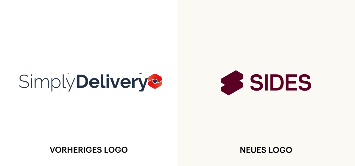
Starting Point: The Brand Was Smaller Than the Business Model
SimplyDelivery was originally strongly associated with delivery services. This suited the product at the time – but no longer reflected how the company had evolved.
The software had long since grown beyond delivery: It connected different processes and channels across the hospitality industry in one modular system. Yet the name continued to tell only part of the story.
Challenge
The brand needed to become relevant to different hospitality business models: delivery services, restaurants, bars, cafés, restaurant chains, and other types of hospitality businesses. SimplyDelivery was no longer just a tool for delivery operations, but a system of interconnected modules that digitalize different hospitality processes. This broad range of capabilities needed to be translated into a clear and memorable brand concept.
-

Growth
The company was in a growth phase. The brand therefore needed to reflect not only the existing product but also accommodate future products, modules, and target audiences.
-

Target Audience
The name SimplyDelivery dated back to the company’s early days as a startup. Hospitality businesses without their own delivery operations did not feel directly addressed.
-

Visual Identity
Nothing lasts longer than a temporary solution: The brand design had become outdated and no longer reflected the digital innovation or modularity that defined SimplyDelivery.
Objectives
The strategic guiding idea was distilled into a concise brand essence: Simply do it.
SIDES aims to help hospitality businesses organize their work more easily, automate processes, and allocate resources where they are truly needed. At the same time, the brand essence reflects the company’s agile way of working. The result was a truly customer-centric brand.
-

From SimplyDelivery to SIDES
The brand name needed to be flexible enough to accommodate a growing portfolio while still conveying a clear meaning. SIDES is always by the side of hospitality businesses. Not as the main course, but as the side that makes the business model complete.
-

Visualizing Modularity
The new brand design visually translates the modularity of the software.
Individual elements can be combined, expanded, and used in different ways.
The design thus conveys a flexible system. -

High Brand Recognition
The idea of “Simply do it” runs as a common thread through the messaging and visual communication: The modular element appears in the logo, animations, and brand touchpoints, making SIDES instantly recognizable.
-

Customer-Centric Story
Neither the technology nor the brand is the hero of the Brand Story. The hospitality businesses are. The Brand Story deliberately places customers and their success with SIDES at the heart of the narrative.
-

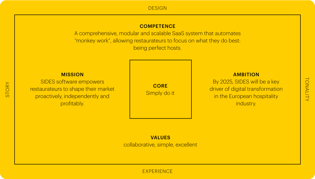
Competence
Using resources efficiently.
SIDES uses software to help businesses make the most of resources such as manpower, time, and energy: where they are truly needed. -

Brand Values
Collaborative – Simple – Excellent
-

Brand Essence
Simply do it
-

Mission
SIDES software empowers all
hospitality businesses to shape
their market proactively,
independently, and profitably:
with a modular system that adapts to the specific needs of independent restaurant owners, restaurant chain managers, and delivery service operators. -

Ambition
SIDES will become the leading
digital transformation driver
in the hospitality industry.
Process: From Analysis to Rollout
-
1
Understand
We analyzed the brand, value proposition, market environment, and target audiences through research and interviews with employees and customers.
-
2
Focus
Based on these insights, we developed the Brand Frame® in a brand workshop with an interdisciplinary team of C-level executives and managers.
-
3
Translate
Based on the strategic positioning, we first developed a new brand name and a customer-centric Brand Story following the hero’s journey framework. We then translated the strategy into a consistent brand design, including a wordmark, key visual, corporate font, color palette, and design system.
-
4
Implement
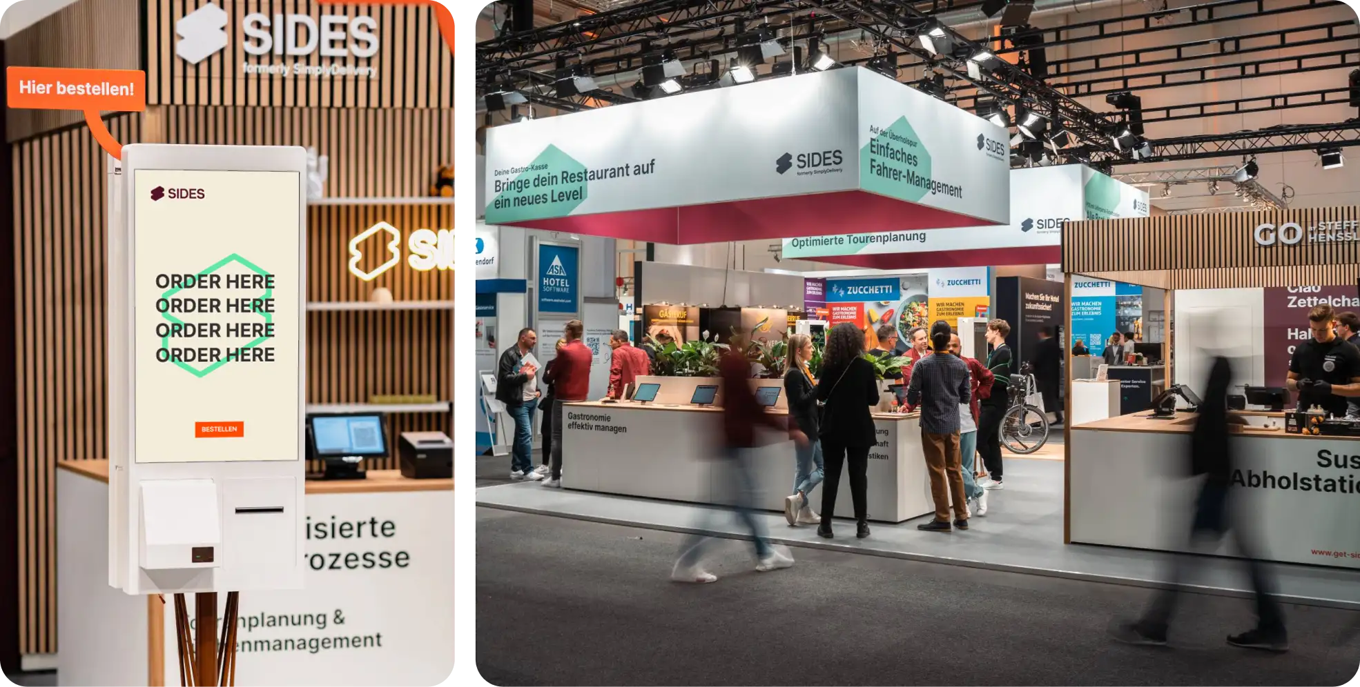
The new branding was rolled out across all touchpoints. The main focus was on the website and the design of a trade fair presence, which also served as the launch platform for the rebranding. Brand Guidelines enable the team to apply the brand consistently across different touchpoints.
The Result – A Brand for the Entire Hospitality Ecosystem
SimplyDelivery became SIDES – transforming a brand focused on delivery into a platform brand serving different areas of the hospitality industry. Today, SIDES positions itself as an all-in-one hospitality software solution. POS systems, online shops, delivery platforms, payments, kitchen operations, self-ordering, and other functions are managed through one integrated system.
Strategic Decisions
Three key decisions in the SIDES rebranding process laid the strategic foundation for the brand’s growth.
-

A Name That Grows with the Business
With its new name, SIDES is no longer tied to a single sales channel or specific functions. The name can accommodate new products and services without being generic, making it valuable in the long term.
-

Client is King
Technology remains important, but the brand primarily communicates what it enables its users to achieve. The visual language, storytelling, and messaging consistently put the success of hospitality businesses at the center.
-

A Clear Brand Idea
The brand essence “Simply do it” expresses the brand’s ambition: We make things as easy as possible for our customers. And we get things done, quickly and with agility. This transforms complex technology into a clear and accessible brand message.
Impact
Refining the brand identity and positioning helped SIDES reach all relevant target audiences during a crucial growth phase: delivery services, restaurant chains, restaurants, bars, and cafés.
-
Target Audience
The new branding and brand name appeal to all relevant target audiences, from owner-operated cafés to restaurant chains.
-

Maintaining Brand Continuity
The new name SIDES is derived from the first two syllables of the previous brand name, SimplyDelivery. This preserved a sense of continuity for customers and the team.
-
Making Modularity Visible
The brand design visually communicates what the brand offers: modularity that grows with the business and integrates seamlessly.
-

Flexible Design System
The design system reflects the brand idea: Its flexibility allows it to be adapted to different applications without having to reinvent it each time.
Naming
SimplyDelivery becomes SIDES: The system isn’t the main course – it completes the business model of hospitality businesses.


Design System
Like the product itself, the design system is simple and flexible to use. Hospitality businesses take center stage in the visual storytelling.

Brand Guidelines
The brand essence “Simply do it” serves as a consistent guiding principle throughout the brand design and brand guidelines.


“Together with Helder, we succeeded in developing a new name and brand identity that resonates even better with our target audience.”
Björn Wisnewski
Founder
Frequently Asked Questions About Rebranding, Naming, and Renaming
When does rebranding make sense?
Rebranding makes sense when a company has evolved strategically and its existing brand no longer accurately reflects this development. Common reasons include a changing business model, new target audiences, an expanded portfolio of products and services, new markets, or significant growth.
The need for change often first becomes apparent in the corporate design or on the website. However, an outdated or inconsistent brand identity is often just a symptom of a deeper issue: The brand no longer reflects the company as it exists today – or the company it aims to become.
What does a strategic rebranding involve?
A strategic rebranding involves more than a new logo or corporate design. Depending on the starting point, the process may include brand positioning, brand strategy, brand vision and mission, brand architecture, naming, brand story, and visual identity.
The goal of rebranding is to realign a company’s strategic direction with its brand identity. The brand should credibly represent the company today while supporting its future development.
With the Brand Frame®, Helder has developed a framework for brand development and brand management. Through a guided process from analysis to launch, we establish clear strategic guidelines for design, communication, and sales.
What is the difference between rebranding and a brand refresh?
A brand refresh updates the existing brand identity without fundamentally changing the brand’s strategic direction. It can be useful when the positioning and brand strategy are still relevant, but the corporate design has become outdated or inconsistent.
A rebranding goes further. It challenges the strategic role of the brand, its positioning, brand architecture, and potentially the entire brand system.
The key question is therefore not simply whether a company needs a new design. What matters is whether the existing brand still aligns with the company’s strategic development.
How are brand positioning and corporate design connected in a rebranding?
Brand positioning and corporate design should build on each other during a rebranding. Before developing a new corporate design, it should be clear what the brand stands for, what role it plays in the market, and what differentiates it from competitors.
This strategic foundation is then translated into a visual identity. Corporate design makes the positioning visible and tangible. Rebranding therefore does more than change a brand’s appearance. It translates the brand’s strategic direction into a clear visual expression.
How do you develop a corporate design that grows with the company?
A future-proof corporate design requires a scalable design system. Today, companies communicate across many different channels and formats – including websites, social media, presentations, digital products, events, and print media.
A good design system therefore defines clear, recognizable brand elements while providing enough flexibility for different applications. This keeps the brand consistent without requiring every application to look identical.
How can you rebrand without losing brand recognition?
Rebranding does not necessarily mean abandoning all existing brand elements. Familiar and distinctive elements can be deliberately retained and further developed.
To achieve this, it is important to distinguish between defining elements of the brand identity and design elements that have simply evolved over time. This allows a brand to evolve without unnecessarily compromising its recognizability.
When does naming or renaming make sense?
A new brand name can make sense when the existing name no longer supports a company’s strategic development. Reasons may include a change in positioning, a new business model, international expansion, a new brand architecture, a merger, or a name that presents legal challenges.
However, renaming should not be driven by design considerations alone. An established name has brand recognition and can represent significant value. It is therefore important to assess whether the strategic challenges actually stem from the name or whether evolving the positioning and brand identity would be sufficient.
What is the difference between naming and renaming?
Naming refers to the development of a new name for a company, brand, product, or service. Renaming, on the other hand, involves replacing or fundamentally changing an existing name.
While naming does not require consideration of an established brand name, renaming presents additional challenges: Existing brand recognition, customer relationships, online visibility, legal considerations, and potential brand equity must all be factored into the decision.
How do you develop a good brand name?
A good brand name is not simply the result of creative ideas or finding the most unusual word. The starting point is the strategic role the name should fulfill for the brand.
The naming process therefore considers factors such as positioning, target audiences, brand architecture, differentiation, and future development opportunities. A longlist of name ideas is then developed, followed by a shortlist that is evaluated for linguistic, cultural, and digital suitability. The finalists should also undergo legal checks.
A name should fit the brand and remain relevant in the long term – even as products, services, or markets evolve.
What should be considered when renaming a brand?
Renaming requires consideration of both strategic and practical aspects. These include the meaning and perception of the existing name, brand recognition, brand architecture, and the impact on customers, employees, and sales.
In addition, new names must be checked for legal availability, domain availability, relevant digital applications, and, where applicable, meanings in international markets.
Especially for established brands, it is important to weigh the brand equity associated with the existing name against the strategic value a new name would actually create.
What happens to existing product names during a rebranding?
Existing product names and brand names do not automatically need to change during a rebranding. What matters is their future role within the brand architecture.
Before making changes, companies should assess which product names are strategically relevant, which have already established brand recognition, and which have simply emerged from the company’s previous organizational structure.
Depending on the outcome, product names can be retained, adapted, integrated under the corporate brand, or gradually phased out. For established brand portfolios, a phased transition can help preserve existing brand equity and recognition.
It is important to implement the new brand architecture consistently across the website, product communication, sales, and all other relevant touchpoints.
How long does a rebranding take?
The duration of a rebranding depends on the scope of the project, its complexity, and the company’s internal decision-making processes.
At Helder, a rebranding that includes brand architecture typically takes around eight weeks. Brand strategy, naming, and website development each require approximately four weeks. Depending on the project, individual phases can be combined or adapted.
The number of stakeholders involved in decision-making has a particularly strong influence on the project timeline. Companies with streamlined decision-making processes can generally make decisions faster and implement their rebranding more efficiently.
How long does it take to develop a new brand name?
The duration of a naming process depends on whether the project involves developing a name alone or also redefining the brand strategy and brand architecture.
A naming project should allow sufficient time to establish the strategic foundation, develop and select name ideas, and conduct the necessary checks. Especially in a renaming project, carefully evaluating the existing brand name is essential.
At Helder, naming is structured as a separate phase that typically takes around four weeks. Depending on the project scope, the process can be adapted and combined with other phases of brand development.
How do you measure the success of a rebranding?
The success of a rebranding cannot be measured solely by whether people like the new corporate design. What matters is whether the brand becomes strategically clearer, more relevant, and more recognizable.
The relevant criteria depend on the objectives of the rebranding. These may include brand awareness, brand understanding, differentiation, customer perception, internal acceptance, or the clear association of products and services with the brand.
A successful rebranding therefore does more than create a new brand identity. It strengthens the brand’s ability to support the company’s strategic objectives in the long term.
Ready to bring your brand to life?
Get in touch.
