 Book Call
Color as a communicative element
Colors are significant, both culturally and emotionally, and that’s what makes the composition of a color climate so central for a brand. Color observers deduce certain properties. It is not for nothing that numerous established insurance companies or financial service providers choose a shade of blue as the main color: blue is considered serious, reliable and radiates calm. Red, on the other hand, stands out, is dynamic and energizing – and is therefore more suitable for entertainment or caffeinated soft drinks.
And doesn’t the green-gold branded fast food chain seem much more sustainable? Orange as the main color, on the other hand, requires sensitivity when developing the design system as a whole, in order not to look cheap.
Colors as three-dimensional model
At the beginning of the 20th century, the US-American painter Albert Henry Munsell developed a color classification system that we still use today. In order to name colors, he defined the three criteria hue, saturation and luminance (lightness).

Color contrasts for conciseness
Color contrasts are used to create tension in design and to highlight important content in color. As branding agency We recommend that a contrasting color be incorporated into the branding. There are basically three different principles of color contrasts.
-

A complementary contrast is defined as two colors, which are based on opposite sides of the color circle. This combination makes the colors brighter and more striking.
-

Blue and green tend to be perceived as cold and orange and red as warm colors. Through our emotional perception, we associate things, states or events with colors: for example, the sun is yellow or fire hot for us, so both tones appear to us as warm colors.
-

The light-dark contrast occurs when light and dark colors are next to each other. The light-dark contrast often creates a dramatic effect
From color harmony to the brand’s color climate
An infinite number of analog and digital colors are available to a brand. The challenge lies in the selection of a few colors that are related to each other.
-

A triadic color harmony enables a particularly high-contrast and versatile color palette for strong, vivid color schemes.
-

A tetrade consists of four colors, which form two complementary color pairs in the color circle.
-

Partially complementary are color combinations of one color with the two adjacent colors of its complementary color.
-

Analog color harmony is the term used to describe three neighboring colors in the color wheel. To balance an analog color scheme, we select one main color and use the others as markup colors.
-

The main color is combined with gradations of itself.
One color can increase brand awareness by 80%
Some brands are inextricably linked to their color climate, such as Coca Cola or Telekom. For the latter, the color magenta is the eponym for products and services; the group even had “its” color protected under trademark law and is taking legal action against companies that still use the color.
Differentiate
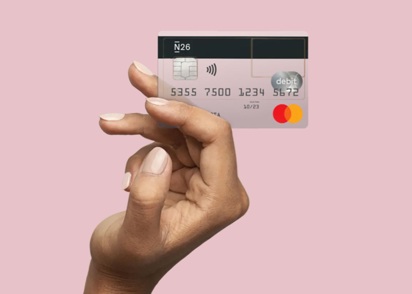
Despite all the attributions, the choice of color climate offers opportunities for differentiation. Companies from conservative industries in particular are often reluctant to deviate from customary corporate colors. The human brain perceives exactly that – the difference, the exception to the norm. Digital financial service providers such as Holvi or N26 are a good example of the delimitation using color: They use specific color palettes that at first glance identify them as innovative players. We therefore encourage our customers not to base themselves too much on supposed industry conventions. And develop individual color climates that are tailored to the respective brand personality and positioning and target group.

How do we define the perfect colors for a brand?
The decision for a brand’s principal color requires a close look at the following aspects:
- Brand Positioning What does the brand stand for, what does it promise, and what feeling does it want to evoke in people?
- Target group Who should be addressed? We analyze the reality of life, preferences, interests of the target group using personas and sinus milieus.
- Differentiation In many cases it makes sense to opt for an unseen color choice in order to stand out from the competition with confidence.
- Suitability The chosen principal colors need contrasting colors, e.g. to attract attention as a call-to-action.
- Balance A balanced ratio is ensured by applying the 60-30-10 rule. This rule of thumb defines the ratio of a composition of three colors.
-
Why are colors important for brand design?
Colors have cultural and emotional meanings and are therefore linked to certain associations. The colors of the brand design therefore influence how the brand is perceived.
-
What is meant by a color contrast?
A color contrast defines the difference between adjacent colors. The greater the difference, the stronger the contrast. Color contrasts create tension in the design.
What color contrasts are there? -
What color contrasts are there?
The most relevant color contrasts include three principles: the light-dark contrast, the cold-warm contrast and the complementary contrast.
-
What is meant by a complementary contrast?
A complementary contrast is when two colors are on opposite sides of the color wheel. This combination makes the colors appear brighter and more prominent.
What is a light-dark contrast? -
What is a light-dark contrast?
Light-dark contrast describes a significant difference in brightness between adjacent colors. Black and white have the strongest chiaroscuro contrast. Often the light-dark contrast creates a dramatic effect.
-
What is a cold-warm contrast?
Based on human sensations, a distinction is made between warm and cold colors. One speaks of a cold-warm contrast when cold and warm colors are adjacent to each other. For example, warm colors include yellow and red, while cold colors include green and blue.
-
What are complementary colors?
Complementary colors are the colors that have the greatest distance to each other in the color wheel. Also called complementary colors, they are directly opposite each other. The main effect is that one of the two colors highlights the other color.
Our design expertise
Using color to evoke the right associations
Not all blue is the same: the choice of a certain color palette does not mean that an identical statement is always made. The creative context of the brand design in which the color is used plays an important role. We create the right associations for brands – with expressive color compositions as part of a design system.
What’s the right color scheme for you brand?
Let’s find out.

Maurits den Held
Co-Founder, Creative Director
Als Creative Director arbeitete Maurits den Held sowohl in der Berliner Start Up-Szene als auch in namhaften Agenturen für Auftraggebende wie Amnesty International, Gore-Tex und Huawei, bevor er mit Dr. Birgit Joest die BRANDING AGENTUR HELDER gründete. Maurits den Held ist Jury-Mitglied des DDC.