 Book Call
Definition and Explanation
Corporate identity includes all the characteristics that define a company.
The idea behind corporate identity is to create a unique and distinctive personality that makes the company clearly recognizable and differentiable.
Values, behavior, tone of voice, and appearance shape how we perceive it. In the same way, corporate identity consists of four central elements that together form the overall image of a company:
Corporate Culture, Corporate Behaviour, Corporate Communication, and Corporate Design.
By creating unique brand personalities, a company differentiates itself from its competitors. Through a consistent appearance and communication that corresponds to the brand personality, the brand creates an unmistakable perception in the minds of its target group.
The development of the corporate identity is a component of strategic corporate management and at the same time the basis for decisions in all areas of the company.
The corporate identity provides orientation for measures in marketing and defines the appearance and communication concept. But the corporate identity is also used and practised in recruiting, in cooperations and in the area of corporate social responsibility. The corporate identity is a holistic concept that tells what the brand is and what it is not.

Die Bestandteile der Corporate Identity
In Brief
Corporate identity encompasses company culture, internal and external communication, behavior toward employees, customers, and partners, as well as the visual appearance at every touchpoint.
What is part of corporate identity?
Corporate identity aims to build a strong corporate personality. In order to develop a brand holistically, the following aspects are relevant for a corporate identity:
- Corporate Communication
- corporate design
- corporate culture
- Corporate Behavior
Each of the elements is interrelated and only if all elements are coordinated with each other, a clear brand image or corporate image is created. The aspects that make up the corporate identity are determined by the brand strategy.

The result of a clear corporate identity: brand strategy.
The Foundation: Brand Strategy
The foundation of corporate identity lies in the brand strategy. It’s like the invisible part of an iceberg – not immediately visible, but essential for design, communication, culture, and behavior.

Elements of Brand Strategy
The following aspects are therefore essential to brand identity:

Brand positioning
The positioning of a brand is also an expression of corporate identity: it shows where the brand is positioned in the market. In order to keep the brand promise, it is essential to include existing potentials and resources in the positioning.

Competence
Competence defines the brand’s value or performance for the relevant target group – ideally in clear distinction from the competition.

Mission
The mission statement answers the question of what the brand does. It is addressed to customers and partners and clarifies the added value for them. It is present and describes the performance in a differentiating and memorable way in one sentence.

Vision
The vision statement answers the question of what the company wants to achieve. It reflects the internal view and serves as a guiding star for the employees. It is future-oriented, inspiring, big thinking – but achievable. As a concise signpost, the statement is no longer than one sentence.

Brand Values
A clearly defined framework of brand values provides internal and external orientation, in day-to-day business as well as in major decisions. This is the touchstone by which messages, products and campaigns are measured to determine whether they correspond to the corporate identity.

Brand Purpose
The Brand purpose describes the intrinsic motivation of a company beyond its own purpose. Nike’s purpose in itself, for example, is to produce sportswear and shoes. The purpose of the brand, on the other hand, is to enable everyone to become an athlete. The brand purpose is becoming more and more important for corporate identity: consumers and employees of the younger generation increasingly value purpose.

Brand name
The brand name is often the first point of contact with the brand, even before the target group knows anything about services or products. We create names that convey the right feeling for the respective corporate identity, stimulate curiosity and remain in mind.
Distinguishing between purpose, vision and mission
At first glance, it is not easy to clearly distinguish between corporate purpose, vision and mission. On closer inspection, however, they form a hierarchy.
The Brand Purpose is at the highest level, floating above things, so to speak. It answers the question of why the company is in the world. In a sense, it is also addressed to the entire world, namely to all stakeholders of the company, both internally and externally.
The Vision Statement describes the longer-term goal of the company, e.g. a positioning or reputation to be achieved. It is aimed primarily at employees and serves as motivation and orientation.
The Mission Statement summarizes the concrete services of the brand in the sense of a value proposition and is accordingly directed primarily at customers.
| Purpose | Mission | Vision | |
| Content | The brand’s raison d’être: what does the company contribute to society? | Concrete benefit of business activities, products, services | Future positioning of the brand |
| Target audience | All Stakeholders | Clients | Employees |
| Orientation | Internal and external | Rather external | Rather internal |
| Classification | Fundamental overarching goal | Short-term goal | Long-term goal |
Corporate Communication
Refers to a company’s communication strategy. Corporate communication encompasses all internal and external communications activities. Here, too, the aim is to create a clear image of the company in line with its corporate identity. One instrument for this is corporate language. It is used to establish the company’s tone and specific language rules.
Corporate communication includes
Brand Story
Due to today’s abundance of information, it is important as a brand to convey messages that are relevant to the target group. Without a clear, unambiguous message, customers do not understand the added value of a brand offer and promise. As a result, potential customers are lost.
A brand story serves as a tool to invite potential customers into a story that is interesting for them: With an individual narrative for the brand that conveys a clear brand message, is customer-centric and has an arc of suspense.

Tonality
Definition of an appropriate tone of voice with which the target group identifies. This includes, for example, deciding whether or not to address customers with the polite form of address, certain words that should definitely or definitely not be used, or how to deal with technical jargon.
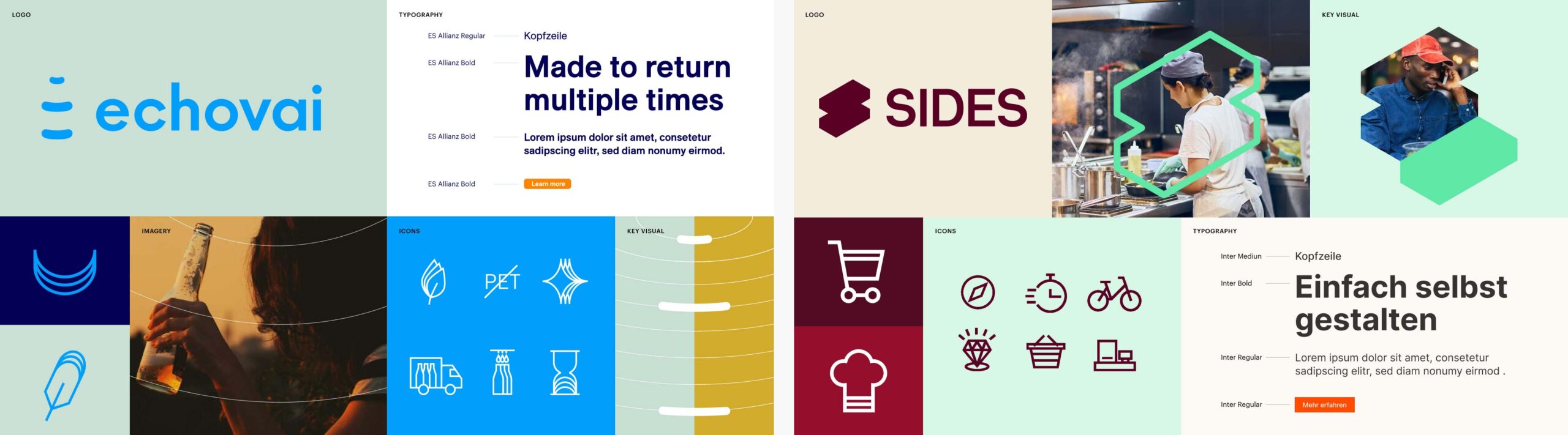
Corporate Design
Das Corporate Design oder CD ist der visuelle Ausdruck der Unternehmensidentität. Es macht auf den ersten Blick spürbar, wofür das Unternehmen steht — mit einem ineinander greifenden gestalterischen System.
The following elements are part of the corporate design:
Logo
The image or symbol that people use to optimally identify a brand at first glance, even if the name cannot be seen. MORE ABOUT LOGO DESIGN

Typography
Fonts used by companies or partially even exclusively designed for them, tell a lot about the character of the brand –Colours are carriers of meaning, both culturally and emotionally. conservative, factual, lovely, disruptive, etc

Color scheme
Colors are carriers of meaning, both culturally and emotionally. From colours, observers infer certain (brand) characteristics. Therefore the composition of a colour climate is a central part of corporate design. MORE ABOUT THE COLOUR SCHEME

Imagery style
Images have the power to communicate emotions and messages directly. Essential for this is not only the motif itself, but the mood of the picture: light, colour climate, contrast and composition. MORE ABOUT THE IMAGERY STYLE

Design grid
The design grid or grid serves to arrange, systematize and stage content. Design laws and principles support the eye movement and thus help to capture content.

Icons
A concise icon system facilitates the communication of content and can contribute significantly to the identity of a brand. Ideally, the brand can be recognized by the style of the icons. MORE ABOUT ICONS
A corporate design briefing is a briefing intended for design agencies and teams preparing to develop a corporate design.
The goal is to ensure that all project participants gain strategic insight into the company, share a common understanding of the creative, content-related, and technical requirements, and have clearly defined expectations.
Corporate Design Manual
Rules for the use of all corporate design elements are documented in the Corporate Design Manual. Clear and binding guidelines make processes efficient and prevent visual arbitrariness. In the brand manual, we create transparency for the consistent application of corporate design elements for customers and trades.

Note
Corporate identity is often used synonymously with corporate design. In fact, however, corporate design is a component of corporate identity, namely the visible component. In the case of persons, the appearance would correspond to the respective appearance and behavior in public, the clothing, the gestures, what someone says and what he or she recognizably takes a stand on.
Corporate Culture
Corporate identity is intended to create a “we-awareness” internally by establishing a corporate culture, the corporate culture. Based on shared values and social norms, corporate culture defines how a company is structured and how members communicate and work internally and with external trades. Organizational culture operates at and between all levels of a company: at the leadership level, in management, between teams and among colleagues, between employees, customers and partners. This includes
- practiced values
- Standards
- Code of conduct
These are intended to ensure that organizational members act and make decisions in line with the strategic direction.
Corporate Behavior
Corporate Behavior regulates the behavior of the company and its employees both internally and externally. This includes
- Purpose
- Leadership style
- Interaction of colleagues with each other
- Behavior of company employees towards outsiders
- Behavior of the company towards the media and the public
The last point in particular is about ensuring that corporate behavior and the corporate identity concept are coherent in order to create the desired corporate image in the eyes of the public, customers, the press or potential employees. This also includes dealing with criticism.
Corporate identity as a concept of strategic corporate management
Corporate identity encompasses the identity of a brand. Since a brand is an abstract construct with the intention of suggesting a certain feeling, this construct can be controlled.
In the course of corporate management and corporate planning, it is essential to deal strategically with the brand in order to be able to achieve set goals. Because a company is not automatically a brand.
Only an implementation in behavior, communication and design that corresponds to the strategy leads to a successful brand positioning.
A clear strategy, which is reflected in all components of the brand identity, makes the brand recognizable and credible for partners, employees and customers. The corporate identity must therefore be strategically developed, maintained and lived.

A company is not automatically a brand. Only when behavior, communication, and design are implemented in line with the strategy does successful brand positioning occur.
Corporate Identity: 9 examples
To better understand the concept of corporate identity, we present companies that have shown that consistent implementation of brand strategy can lead to a strong brand personality:
-

DCSO
The starting point is the dome, which is composed of many units, representative of community members. The theme of cybersecurity runs through the color scheme and iconography. The protective sphere can be depicted from different perspectives and still form a recognizable element – such that the brand can be recognized even without a logo.
-

Ben & Jerry’s
Everyone knows the brand’s playful ice cream packs. Although the innovative flavors and fair ingredients help Ben & Jerry’s maintain a strong position in the market, it’s the branding that has transformed shoppers into loyal customers who are happy to spend a little more on their ice cream. Ben & Jerry’s have created a brand world that puts activism and solving the problems of our time at the heart of the brand.
-

Patagonia
Quality that lasts is founder Yvon Chouinard’s credo. A strong focus on quality and sustainability is the brand’s recipe for success. For years, the company has posted sales in the millions, despite – or perhaps because of – a minimal marketing effort. Instead, the company focuses on consistent branding that makes quality and sustainability tangible and thus leads to a loyal community.
-

Lululemon
The Canadian It-label for yoga and sportswear combines functionality, comfort and aesthetics with the yoga philosophy of life. Lululemon communicates it in their Purpose: Living a life in practice leads to a more purposeful life – on and off the mat. Lululemon expresses the attitude of many yogis in their branding.
-

Adobe
Every year, Adobe is named one of the most attractive companies in the world. This is not only due to modern offices and healthy meals, but also to an appreciation that runs through all structures. Employees are the focus: Paid training and flexible working hours are designed to contribute to physical and mental health. With its “Adobe Cares” program, the brand promotes the motivation and commitment of its employees, who are the most important asset in the creative process.
-

Airbnb
The rental and travel platform Airbnb stands out for its welcoming and inclusive language for hosts, guests, and employees alike. Acceptance is a core brand value that is also lived out in internal and external communications. The brand slogan “Don’t just go there. Be at home there,” suggests that everyone belongs everywhere in the world, regardless of social and ethnic background or sexual orientation.
-
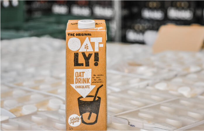
Oatly
Sold out – It’s not uncommon for this to happen at Oatly. Demand for their oat milk products is often greater than what Oatly can produce. Strong positioning and transparent communication make up Oatly’s branding. Swedish roots and sustainability is ingrained in the brand DNA. With its rebellious branding and provocative campaigns, Oatly draws attention to the health and environmental consequences of oat milk over cow’s milk.
-

Apple
The bitten apple is arguably the most famous logo in the world. Since its inception, Apple has focused on relationships with its customers and building a loyal community. The branding of the brand achieves the suggestion of certain emotions and invites consumers to become part of the Apple community. With the “Shot on iPhone” campaign, Apple puts its customers at the center.
-

Fritz-Kola
The Fritz company has made soda drinking political. With opinionated advertising and initiatives that fight right-wing radicalism and homelessness, Fritz-Kola sets itself apart with more than just its flavors. Since 2003, the soda has stood for a radical but at the same time sympathetic attitude. This corresponds above all to the attitudes to life of the younger generations. The logo now dominates the image of counters in numerous bars.
Corporate Design elements after the rebranding of DCSO
The corporate identity strategy pursues the following goals
Internally
- Transparent and cooperative processes lead to better collaboration
- Better performance through a sense of community and brand understanding
- Higher loyalty to the company through greater satisfaction
- A clear vision helps employees work toward a common goal
- A common understanding of the brand leads to efficient communication
Externally
- A consistently established corporate identity is more quickly and better remembered by the target groups.
- A distinctive brand image sets the company apart from its competitors
- Clear messages create an understanding of the added value of the brand among customers
- A tangible and tangible brand identity creates customer loyalty
- A corporate culture that is lived out attracts outstanding talent
- New products and services benefit from positive brand image
Templates for creating a corporate identity
-
Summarize your brand identity at a glance: With our Brand Frame® template
-
The SWOT analysis is a proven strategic method that helps companies to identify their strengths, weaknesses, opportunities and threats.
-
A mission statement formulates the added value of a brand’s services and is an essential part of the brand identity.
-
Define for whom and for which needs the brand offers solutions
-
Define a specific goal that the brand wants to achieve within a defined period of time.
-
Align the social added value, the needs of the target group and your own goals.
-
In order to develop a successful brand strategy, it is important for companies to analyze their target groups in detail. The creation of buyer personas helps to create a better understanding of the target group.
-
Clarify the Why, How, and What of your brand to form the strategic foundation.
-
Define the brand identity on 3 different levels with the identity prism template.
-
The brand steering wheel according to Esch is suitable for a systemic analysis of the brand.
-
Develop brand values with examples and exercises and define what the brand stands for
-
The Unilever Brand Key is a brand strategy model, focuses on competitors and target groups.
-
The Bates Brand Wheel captures a brand’s essence in 5 steps, analyzing attributes, benefits, values, and personality to communicate the core identity.
-
Define the brand personality: with the Brand Personality Sliders template.


How much does a corporate identity cost?
The cost of a corporate identity depends on the scope of the project. The size of a company, whether subcontractors need to be considered, and which communication materials need to be created all influence the cost of a corporate design.
The Alliance of German Designers has drawn up a remuneration agreement that provides orientation for designers and companies in the calculation of services. The AGD’s design remuneration agreement sets an hourly rate of 105.00 € per hour (net). Accordingly, the following guideline values result:
BRAND AUDIT: from € 1,200
BRAND STRATEGY: from € 15,000
Brand Story: from 7.500 €
NAMING: from 7.000 €
Corporate Design: from 15.000 €
Who is your company?
Let’s find out.

Dr. Birgit Joest
Co-Founder, Strategy Director
Als Brand Strategist hat Dr. Birgit Joest internationale Marken wie Mercedes-Benz, Telekom oder O2 betreut, bevor sie mit Maurits den Held die BRANDING AGENTUR Helder gründete. Birgit Joest ist Beirätin, zertifizierte StoryBrand Guide und Vorstandsmitglied des VdU Berlin.